

THE LOGO
Our client, Sumitomo Corporation contracted us for a logo and a visual identity set for their power plant investment, Van Phong Company Limited. As for the logo, Sumitomo specified a design style using only the initials of the company’s name which is VPCL. This typography only style is a typical Japanese way of branding where the corporate name becomes the logo itself without a prominent symbol like Sony or Toshiba. The job appeared simple and straightforward but it was not the least so.
Starting out on the first round, our design team came up with a dozen of design concepts all typography-based. We tried the best to express in the designs the power production business’s characteristics such as:
- Dynamism
- Movement
- Energy
- Environment-friendliness
Above all, paid attention to enhance the visual continuity in each design to denote the electric flow. After three rounds of design, Sumitomo narrowed their selection down to a shortlist of three design concepts. They called for our technical advice and rating of each concept to facilitate their decision toward a final best design. In response, we made a presentation to rate the designs and give our remarks on what we considered the strengths and shortcomings of each.
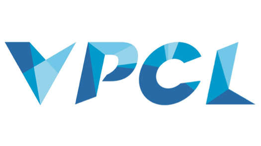
Figure 1 – The first shortlisted design concept using a mosaic pattern with various shades of blue which is reminiscent of electric flashes. It is highly dynamic and strong with an industrial look.
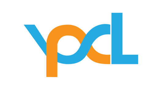
Figure 2 – The second shortlisted design concept which emphasizes visual flow by blending V, P and C together and both leading to L. The orange color means energy and the blue stands for cleanliness.
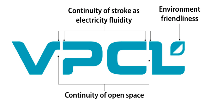
Figure 3 – The third design concept also the simplest was selected by Sumitomo as final. We rated it as the top concept in terms of simplicity, consistency, continuity, perceptibility and uniqueness
And in the end, our top choice also became Sumitomo’s choice. The design concept we rated as the best proved the most convincing to Sumitomo and won their favor.
The final design being highly fluent and open, denotes the flow of electricity as well as a smooth-running power generation business open to opportunities and growth. The V letter flows into the P and the C letter flows in the L. Even the spaces between the letters seem to connect as none of the letters has an enclosed interior. Everything seems to fit together in a consistent and eye-catching visual flow. The leaf filling the hollow of the L letter symbolizes environment friendliness as a key business value.
Thanks to its simplicity, the logo can be easily represented or reproduced in various ways digitally on web and computerized materials as well as physically via printing, embroidery, molding, cutting, embossing, engraving and so on.
THE IDENTITY SET
Designing the VPCL corporate identity set was not hard for us after the VPCL logo had been completed. We simply picked brand colors, designed a series of templates including stationery, some materials and merchandise items. And last but not least, we selected a font for VPCL to be used as its corporate identity font.
All identity expressions were congregated into a visual brand manual which also contains description of and instructions to use each and every element properly.
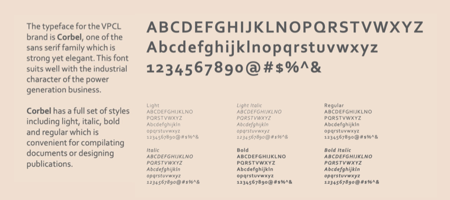
Figure 4 – The Corbel font was selected as the identity font for VPCL. It is not not elegant but also Unicode-enable thus supporting Vietnamese type.
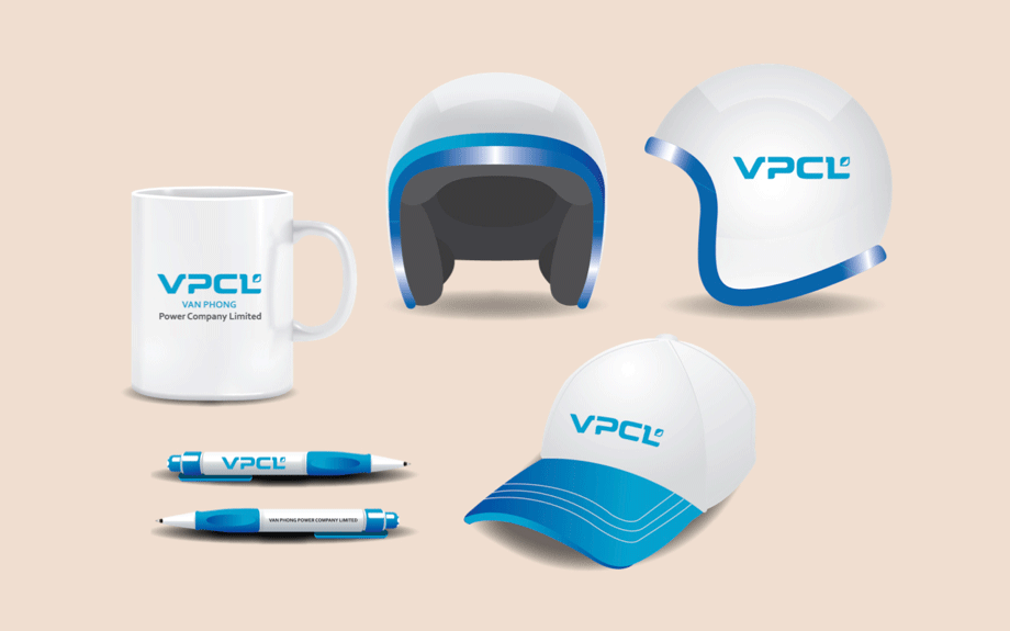
Figure 5 – VPCL mug, pens, cap and helmet.
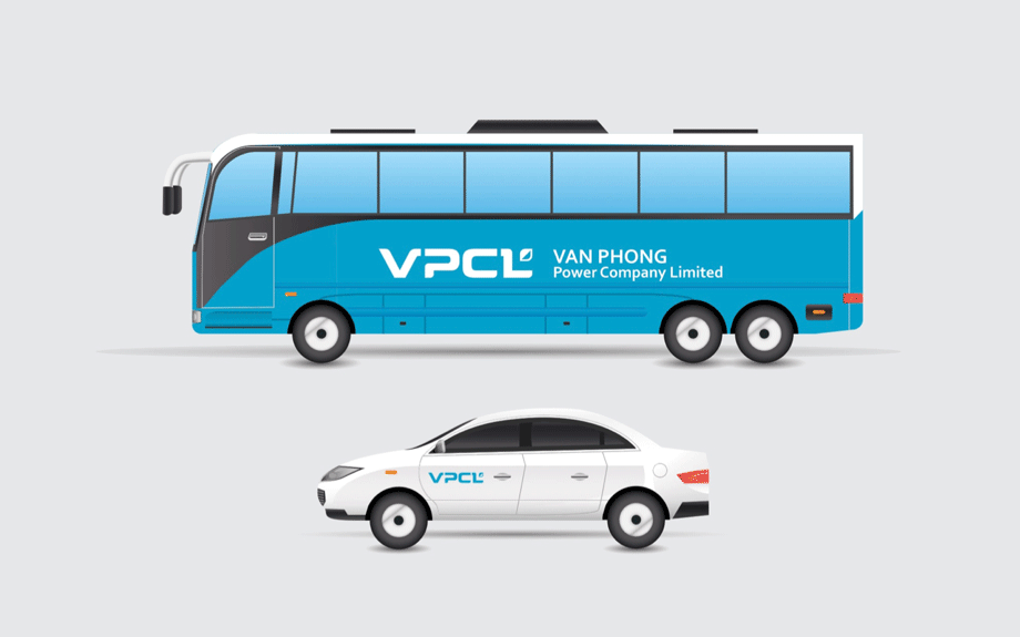
Figure 6 – VPCL bus and car.
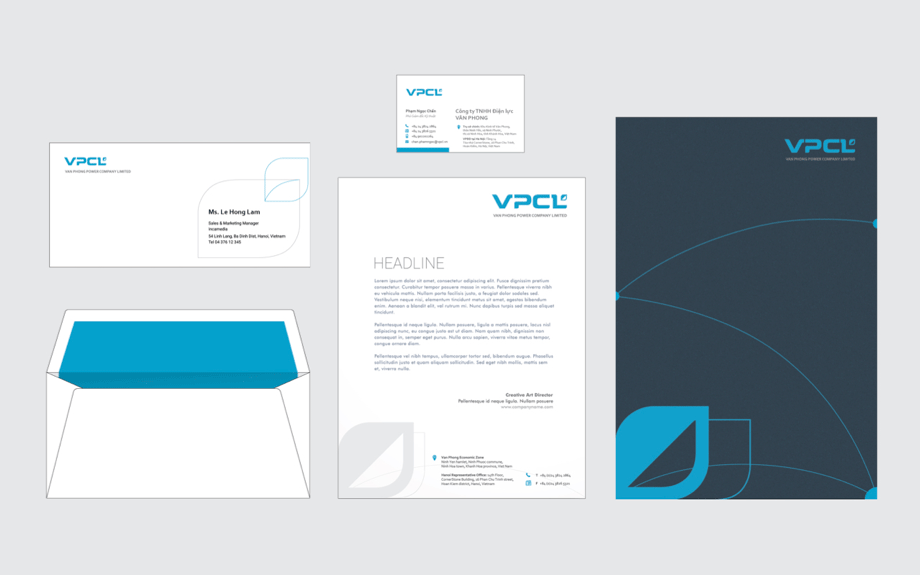
Figure 7 – VPCL stationery set including business card, letterhead, envelope and folder.
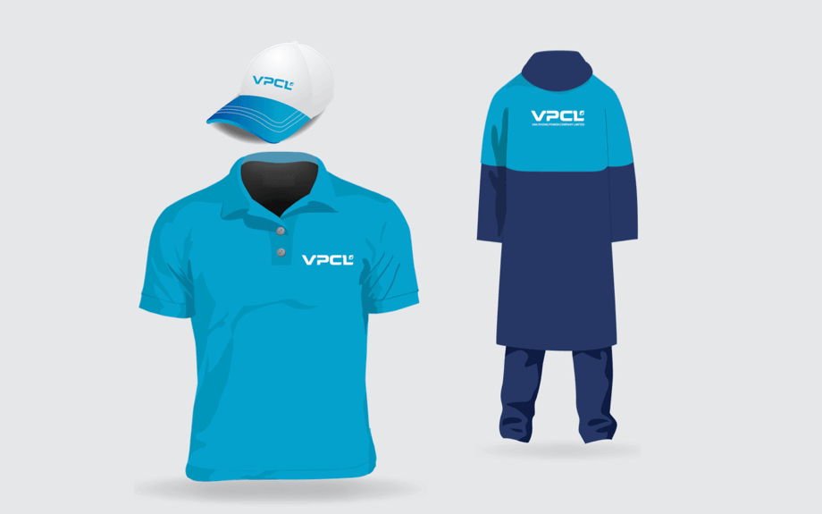
Figure 8 – VPCL t-shirt, cap and rainsuit.
Recent Comments