In late 2017 we were hired by CARE International to design and test a set two posters and two booklets about the government’s Program 135 on poverty reduction for marginalized areas in the 2016-2020 period and the government’s Decision 2085 on socio-economic development support for ethnic minority populations in the 2017-2020 period. These materials were specifically aimed at the Khmer inhabitants in Tra Vinh province. For the posters and booklets to logically and emotionally connect, the Khmer audience should see themselves and their villages in them. Our designs with a considerable number of hand-drawn illustrations therefore were supposed to realistically feature the Khmer people in their daily activities and their living environment. Before setting off on design, we spent a significant amount of time studying on the Khmer people in relation to their facial features, clothing, housing architecture and lifestyle as well as the landscape in Tra Vinh. We also produced illustration sketches for previewing from what we understood as suited to the Khmer communities in Tra Vinh.

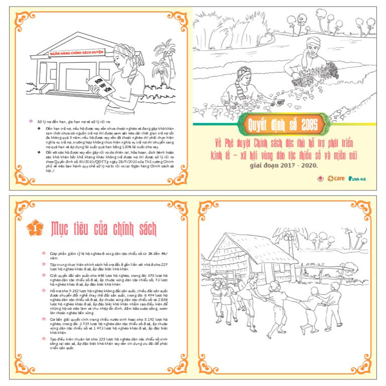
Figure 1 – Initial design of a booklet with illustration sketches depicting the life of the Khmer people in Tra Vinh. Even their framing boxes on pages were made after common parttens often found in Khmer artworks and architectures.

Upon the shortlisting of design concepts by CARE in Hanoi, we sent a team to Tra Vinh province to conduct a field test on design relevancy. The test was part of our contract to ensure that our works really met the requirement for real-life reflection and matched the target audience’s preference. Our testing team brought full-sized color sample prints of the posters and booklets to Tra Vinh. And for two days, they organized sessions for Khmer representatives from local authorities and communities to view and comment on the samples.

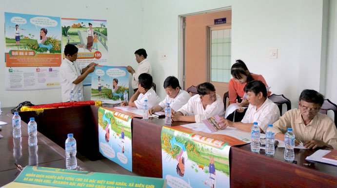
Figure 2 – A viewing session in An Quang Huu village, Tra Cu district, Tra Vinh province, with participants who were Khmer minorities representing the local village’s authorities and the community.

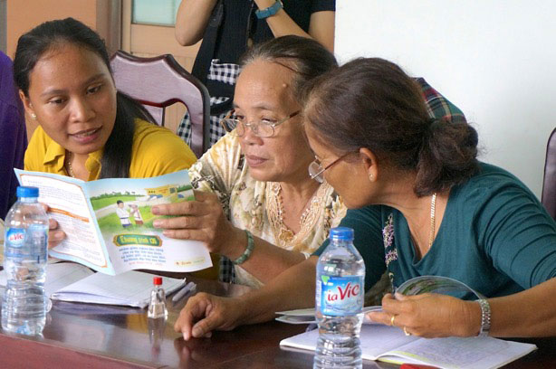
Figure 3 – Khmer women participants were scrutinizing a booklet design on Program 135.

In general, participants liked our designs but they also pointed out some irrelevancies to our pleasant surprise. Here are the typical mismatches between what we had imagined and realities:

  • The Khmer people in Tra Vinh only wore their traditional Sarongs on special occasions like ceremonies or festivals. For daily life, they wore regular clothes much like the Kinh people.
  • The Khmer people preferred colored shirts especially purple to
  • The Khmer women still knotted their hair into chignons but not high up.
  • The Khmer temples in Tra Vinh had tapered column roofs with pointed tips not A-shaped roofs like Vietnamese and Thai temples.

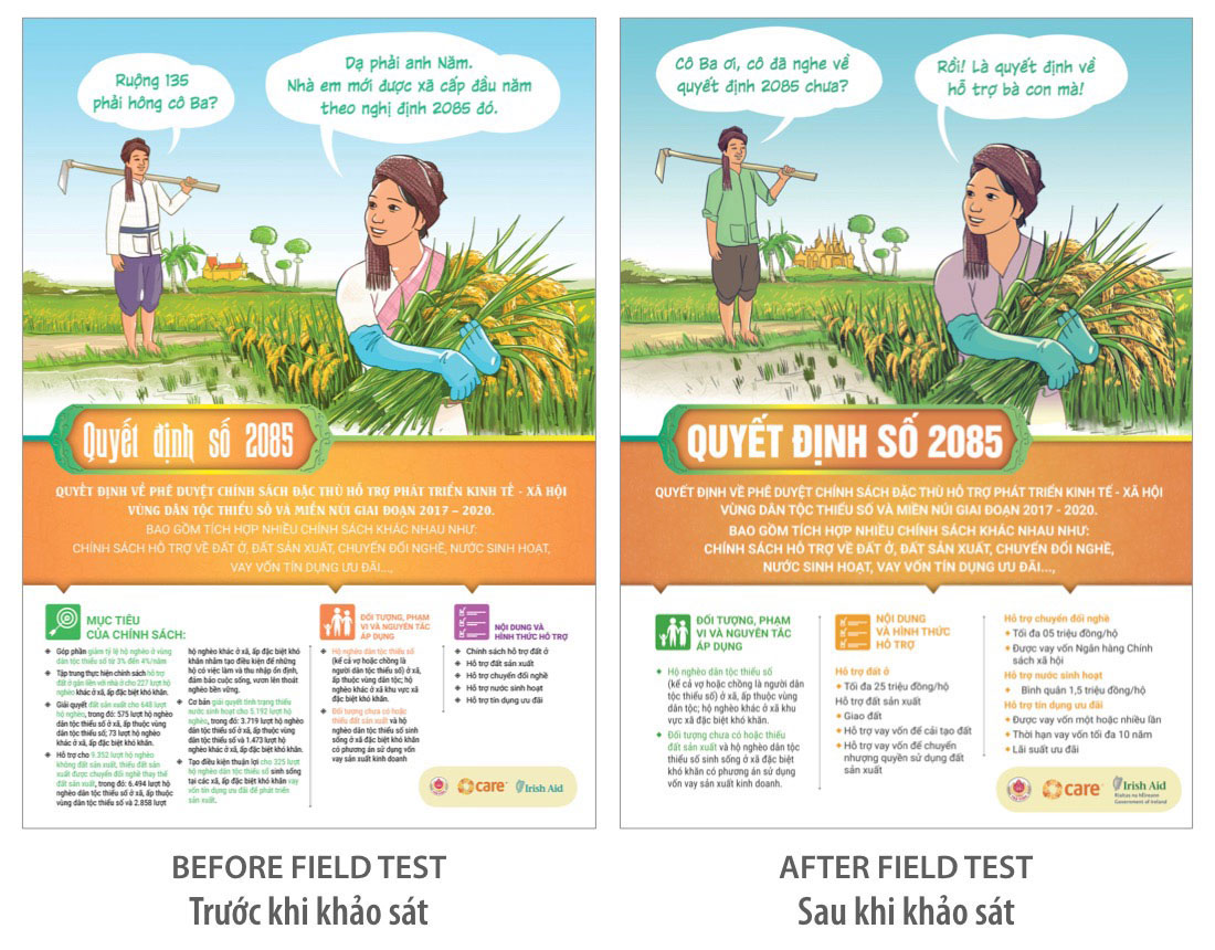
Figure 4 – In the revised poster design on the right the Khmer woman wears a shirt instead of a traditional costume, the Khmer man wears a green shirt without a cloth belt, and the temple in the background takes on pointed and column-like roofs in replacement of the previous A-shape roofs.

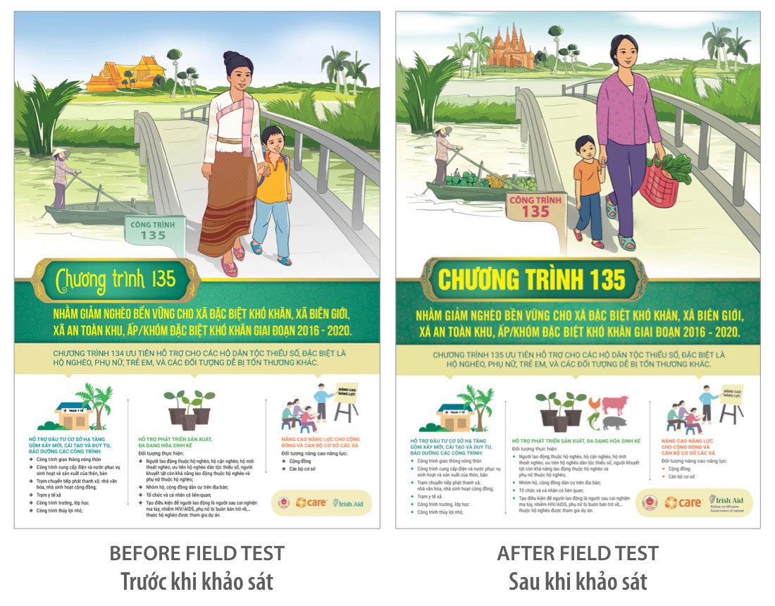
Figure 5 – In the revised poster design on the right, the Khmer woman wears a purple shirt and a pair of regular pants instead of a Sarong, her chignon was down in the back of her head instead of being on top, and the Khmer temple in the background takes on pointed and column-like roofs in replacement of the previous A-shape roofs.

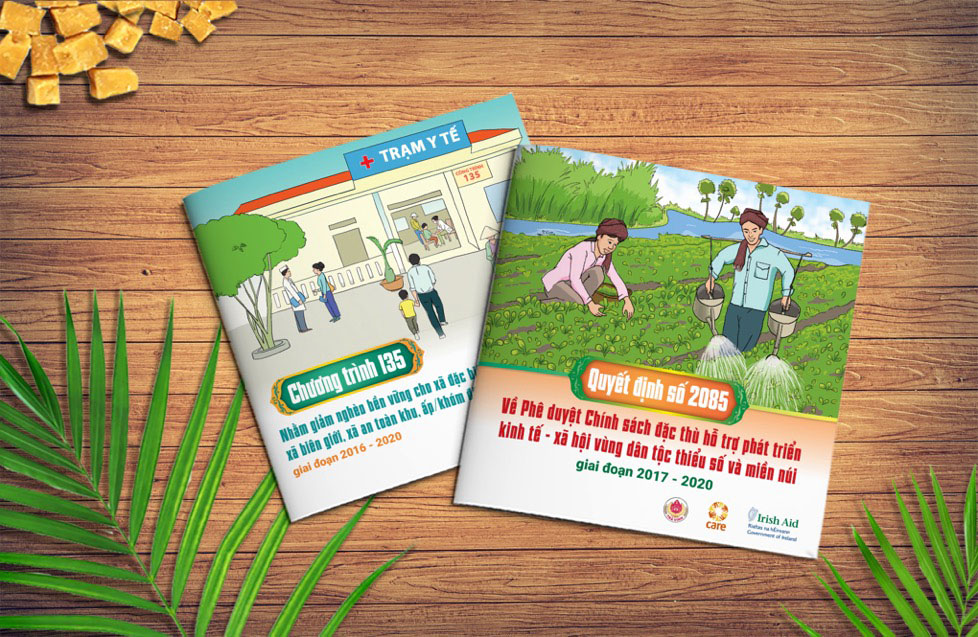
Figure 6 – The final and complete designs of the booklets.

Back in Hanoi, we revised the illustrations and designs based on input collected from the field test. The revised designs then were not only carefully reviewed by CARE in Hanoi not but their digital versions also were emailed to Tra Vinh for final evaluation by test the participants. They were soon accepted as the final designs qualified for printing and both CARE and the local participants were very happy to have the posters and booklets to their liking.

Previously we had conducted similar field tests on designs for other clients. Through each test, we came to understand more and more about why designs of communications materials should reflect the real life of the target audience. Realistic reflection is what makes a design convincing.