

Our client, Action For Vietnam is a development organization which operates for poverty elemination, social equality and women empowerment. They demanded a logo based on their abbreviated name AFV carrying a hero’s personality with the spirit of pioneering, development, femininity and related to Vietnam. Apparently, creating such a logo is extremely challenging to any graphic designers including those experienced in visual identity design. Initially we thought there could be only two designing approaches:
- Logo of typograhy only for the abbreviated name
- Logo of a graphic symbol and the abbreviated name
After five rounds of design involving five graphic designers and a Creative Director, we came up nearly 100 design samples based on various concept. And throughout this process, we found a new approach of integrating a symbole into the abbreviated name. Thanks to this new finding, we achieved a design which fit right into the clients’ expectation.
The logo with 03 letters AFV standing for “Action for Vietnam” features a heroine with fluttering hair and one arm reaching upward in a triumphant posture symbolizing Vietnamese women’s pro-active role in creating changes as well as their confidence and capability to do so. The V letter is transformed into a woman to emphasize Vietnam in relation to gender empowerment. The pure red color used for is also the color of Vietnam’s flag to represent Vietnam and action. The logo carries a hero’s personality; strong, pioneering, dynamic, optimistic, liberal and passionate. Yet it conveys femininity via soft curves which make it elegant and flowing. The letters are made of thick strokes and the logo does not have any tinny details which can obstruct visibility especially when shrunk down in small sizes. With only give graphic elements and one color, this design is minimalist by style and therefore strictly adhearing to the visual branding rule of “Simplicity.”

Three color variences for the logo inncluding black, light grey and white on red background (negative).
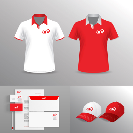
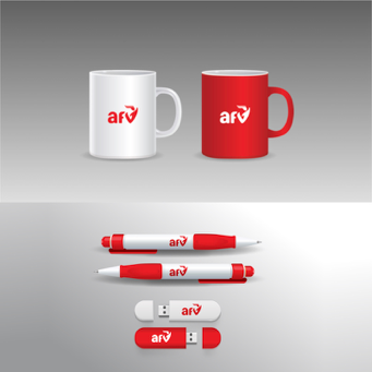
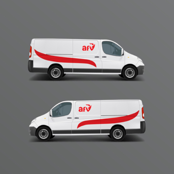
For being so simple, the logo can be easily and accurately reproduced on print materials and through other forms such as embroiding on t-shirts and caps. In the negative form, the logo’s red color becomes the background the the logo itself is whilte. Negative presenation is in deed very clear and impressive. Other color variences are only limited to black and light grey to enhance the logo’s minimalist style and recognizability.
On materials and merchandise items, the logo delivers a very good visual impact through both positive and negative forms. The red color which is set for the identity color of AFV by and large makes a strong impression on viewers.
The AFV logo was a tough yet exciting visual identity design project and that makes it worthy and memorable for us. Our efforts and creativity were eventually translated into the core image of a reputable brand on social development and gender equality in Vietnam. What a pride!

Recent Comments